01
The homepage
Four typefaces, each with its job
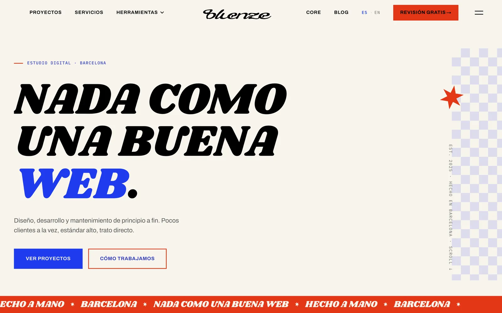
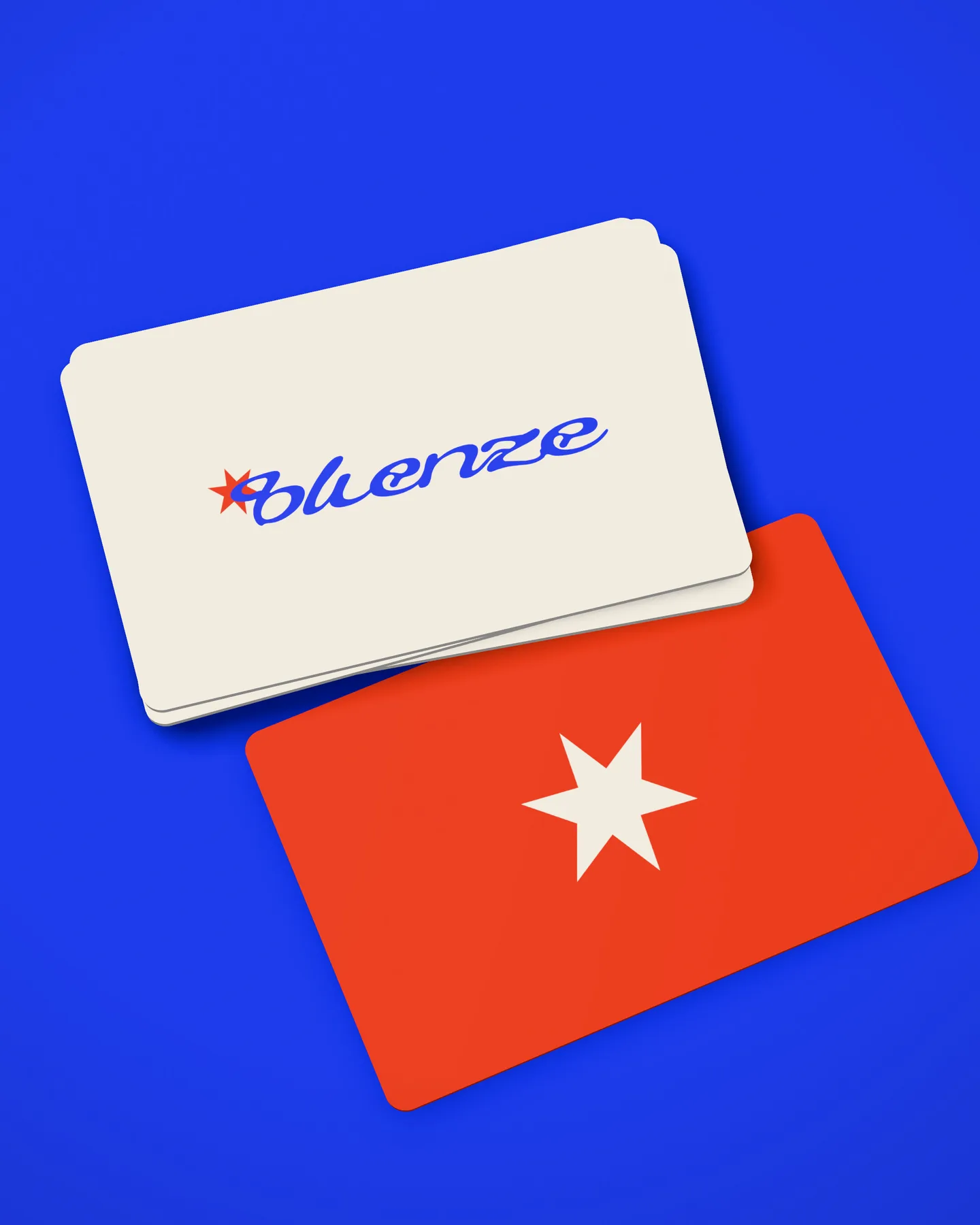
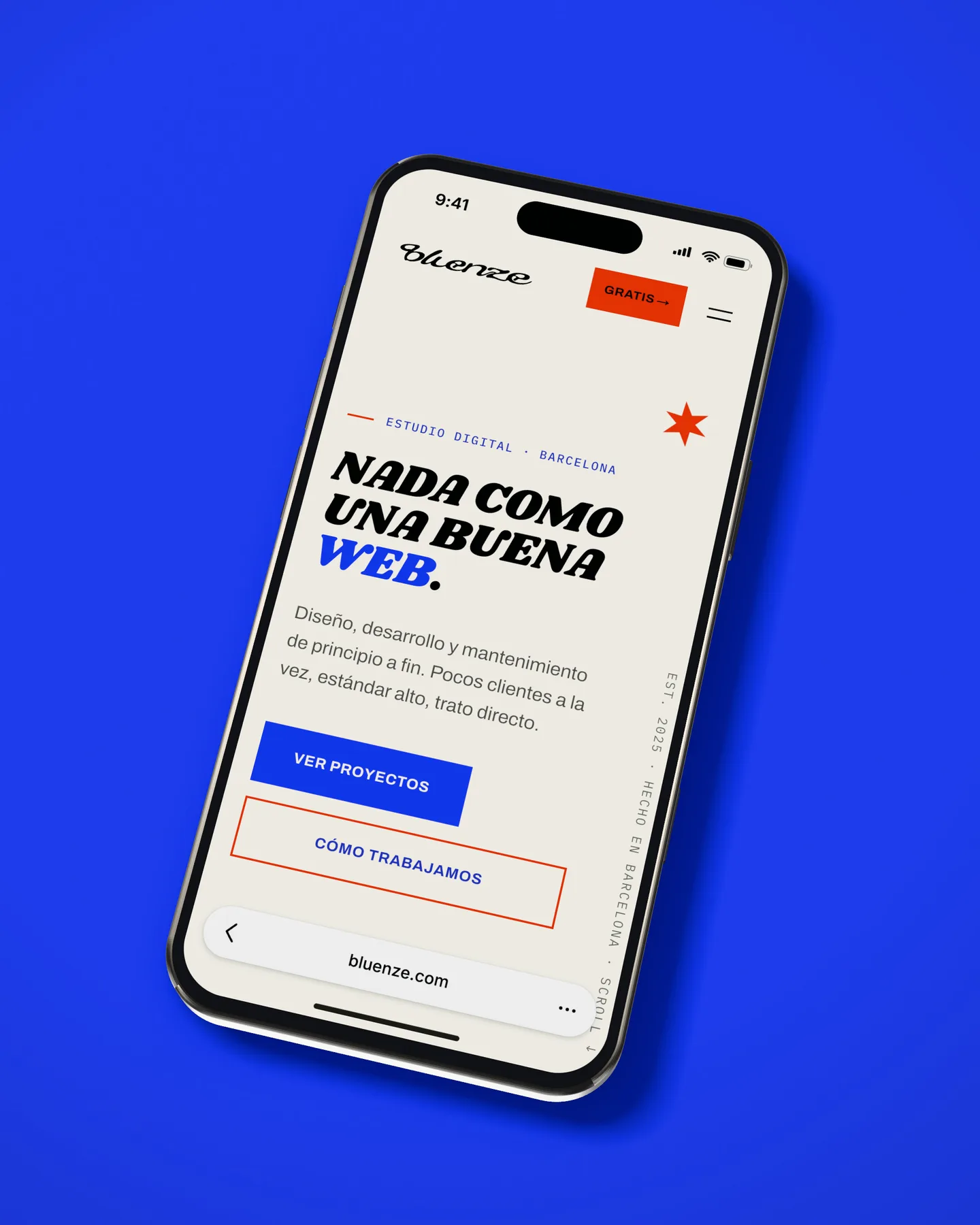
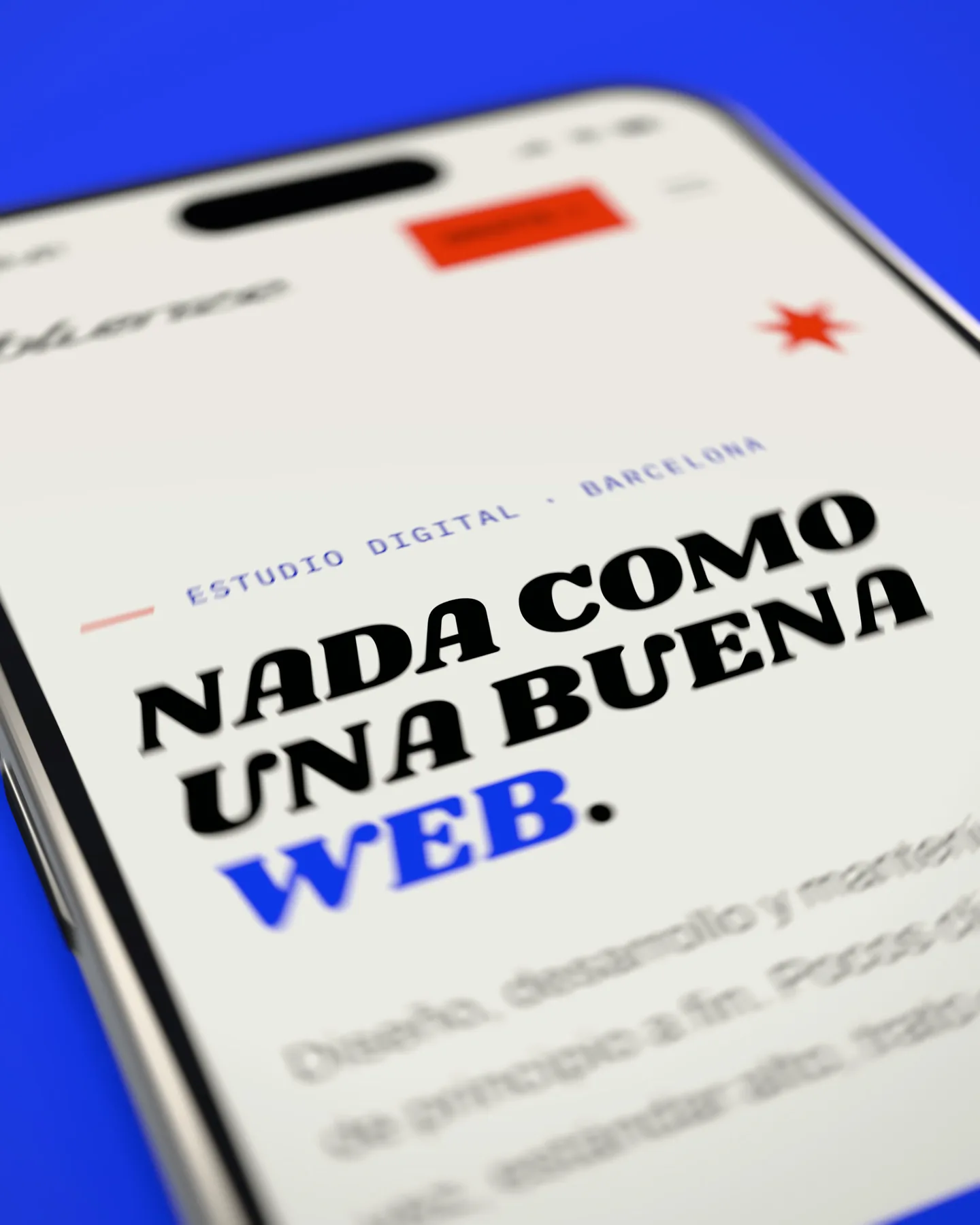
“Nothing like a good website” shouted in Shrikhand, the spinning star and the red ribbon. And everything else moves on four curves which, yes, have names.


What we did
Their palette
In July 2026 we changed our brand and rebuilt the website. The old one was fine and said nothing: a shy navy blue, the typeface half the internet uses, and a “we” that was really just one person.
The new one has two names behind it, shows the prices and gives away tools with no sign-up: colour palettes with reasoning, a test to see whether people can find you, and how Google sees you.
01
Four typefaces, each with its job
“Nothing like a good website” shouted in Shrikhand, the spinning star and the red ribbon. And everything else moves on four curves which, yes, have names.
02
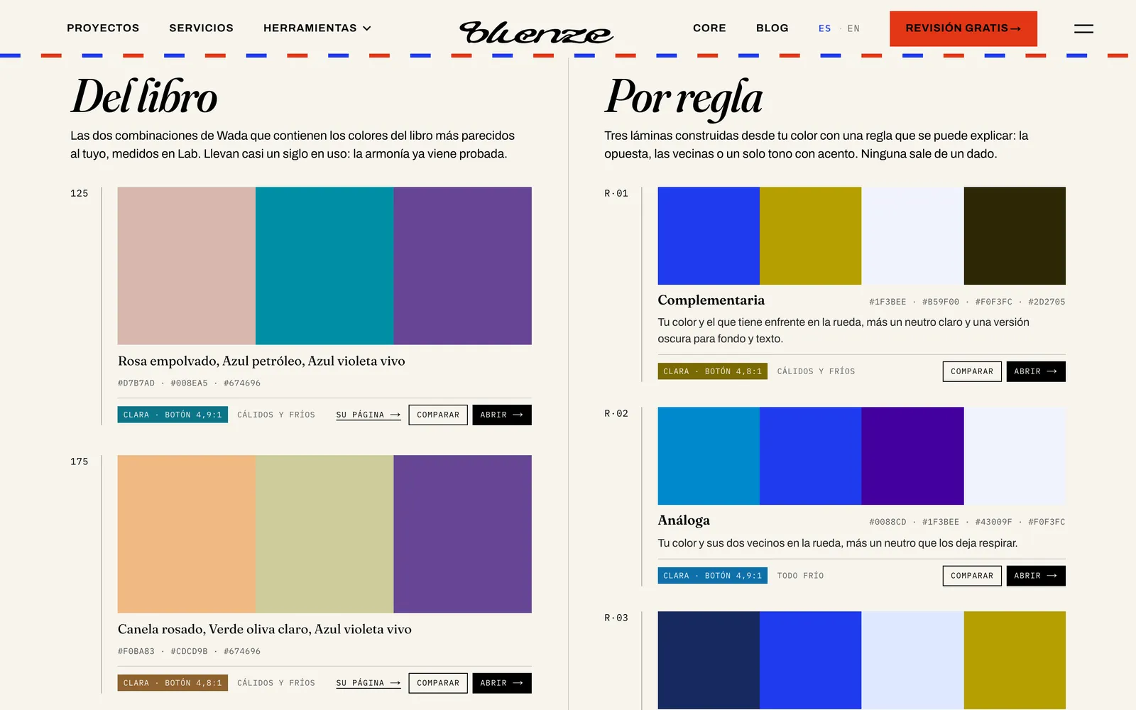
Five plates for your colour
Pick a colour and you get two combinations from Sanzō Wada's 1933 dictionary and three by rule, with the button contrast measured and colour-blindness simulated.
03
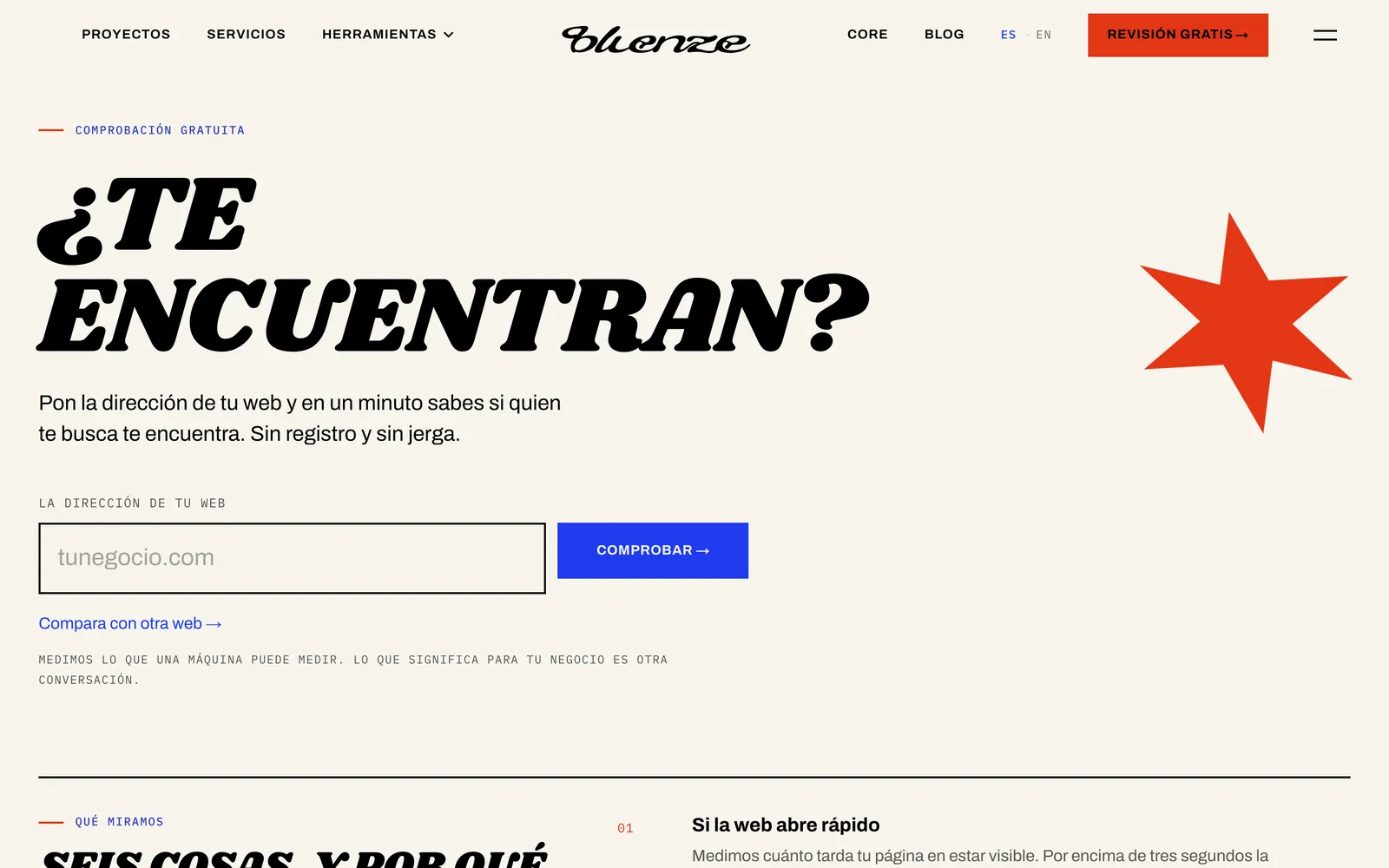
Six checks, no sign-up
Enter your website and in a minute you know whether it loads fast, whether it's secure, whether it reads on mobile, whether it says what you do, whether people can reach you and whether your Google profile shows up.
04
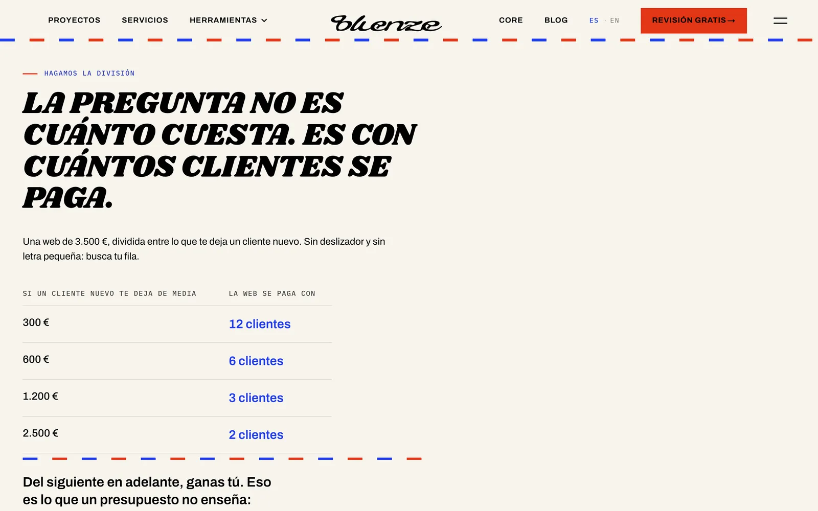
Nothing hidden here
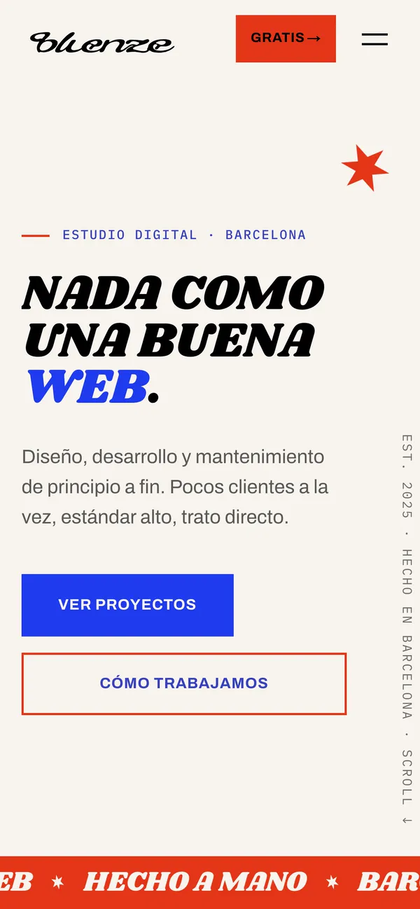
The intro, the case row and the tools, rebuilt for the thumb.
Our before has its own page
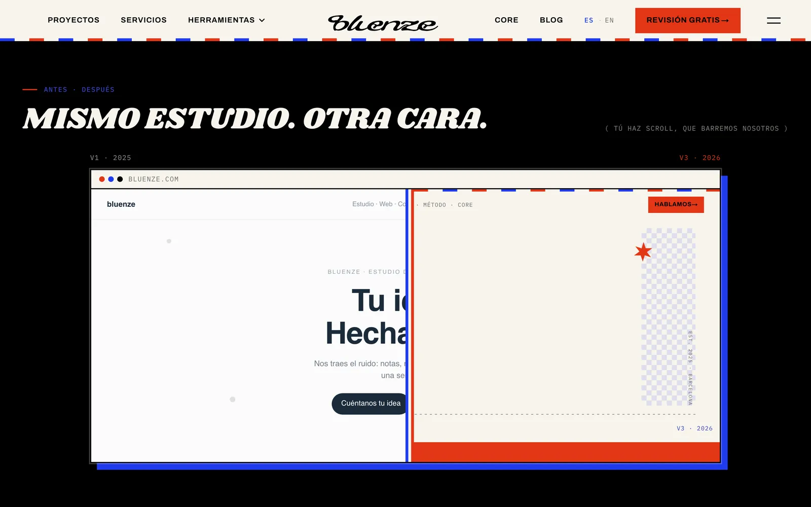
If you want to see where we come from, the 2025 website and brand are rebuilt on our rebrand page, with a sweep across to today's.
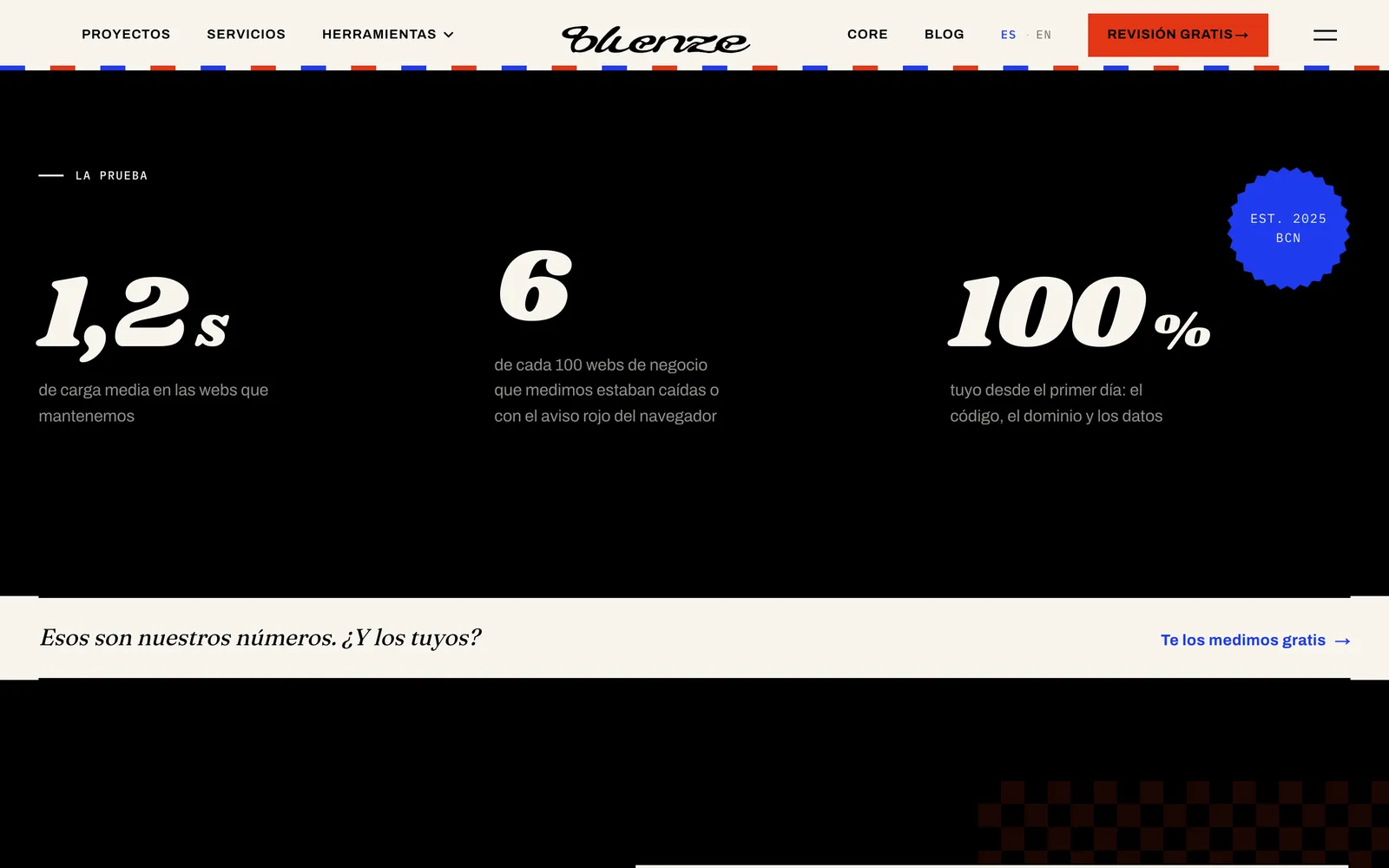
See the rebrand →Heads-up: load times are for the homepage, measured on desktop on 14 October 2026 with no network throttling. A rough guide, not a Lighthouse score.
Half an hour, free, with the people who'd build it. And no “we'll get back to you” at the end.